Pressed to Impress: Practical Design for Letterpress
Printing a 3-color design on the Heidelberg Platen Press.
There’s something irresistible about letterpress printing. Maybe it’s the tactile nature of the paper. Maybe it’s the crisp type, pressed deeply into cotton fibers, leaving behind a memory of the press’s motion. Whatever it is, designing for letterpress isn’t just about making things look good — it’s about making them feel good.
Whether you’re creating wedding invitations, business cards, or bespoke art prints, your design process has to sync with the centuries-old mechanics of this craft. Here's how to create with letterpress in mind — and heart.
1. Less Is (Deeply) More
Letterpress thrives on simplicity. Think high contrast, bold lines, and generous negative space. Once a craft of subtle “kiss” printing (no show through on the back of the paper), letterpress has evolved into an art of bold tactility — where deep impression is no longer a flaw, but the feature that distinguishes letterpress from other printing methods. Today, it’s not just about what you see, but what you feel — a physical echo of the printing process itself.
🖋️ Pro Tip: Leverage strong, clean typography no less than 6pt in size and avoid fine hairlines under 0.25pt (.003). Fine letterpress printing is about the marriage of design, type, high-quality paper and the history of the printing process itself.
2. Choose Typography That Pulls Its Weight
Not all fonts play nice with the pressure involved when letterpress printing. Type with ultra-light/hairline serifs or distressed faces might look cool on screen, but they can vanish with letterpress or print inconsistenly on the paper. Instead, opt for typefaces with strong structure and weight.
💡 Think: Classic serif faces, scripts, and clean sans-serifs print beautifully!
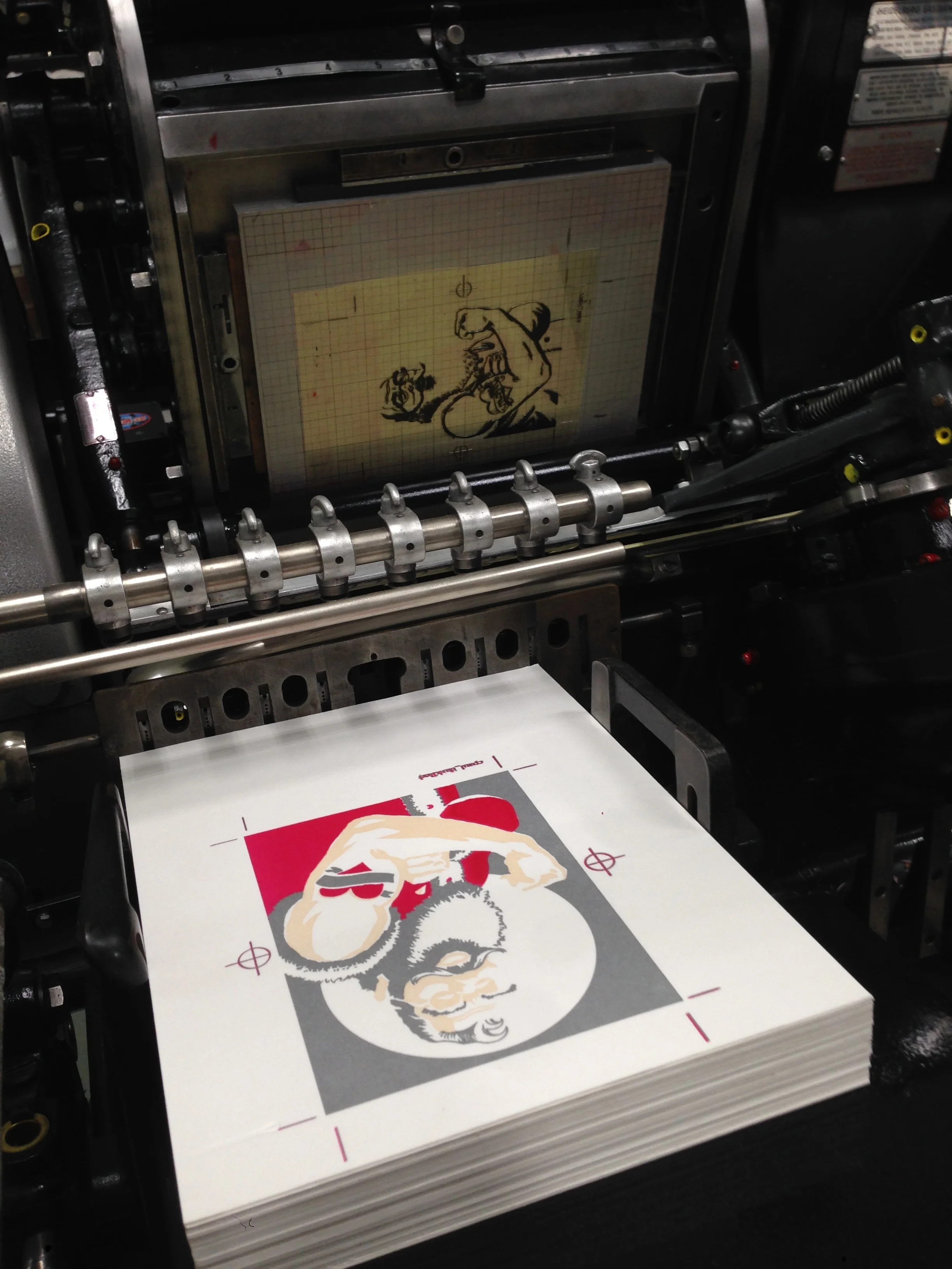
3. Color: One at a Time, Please
Letterpress, as a process, involves laying down one ink color per run. That means every additional color = another setup + another pass through the press. This is why letterpress printing can be a time-consuming endeavor. Keep this in mind as you design.
🎨 Pro Tip: Think strategically about how to elegantly leverage colors. Embrace the beauty of clean designs. Consider leveraging blind debossing — printing without ink — to add additional dimension and enhance the tactile experience of the letterpress experience. Avoid large areas of solid color as these will print inconsistently.
4. Paper Isn’t a Canvas — It’s a Character
Letterpress shows best on thick, soft paper that can take a hit — think cotton or handmade sheets at least 110# cover weight. This paper isn’t just a passive surface; it’s a critical part of the experience.
🧵 Choose: at least 110# cover or more made for letterpress. Double-thick stocks elevate the impression (quite literally!). We offer a broad range of paper choices made specifically for the letterpress process in a variety of weights.
5. Registration, Bleeds and Borders? Handle With Care
While modern letterpress can achieve remarkable precision, it’s not digital. Our presses are incredibly engineered machines, but they are also over 60 years old. Type and printed art can shift slightly as the paper stretches from one print to the next. While we are proud of our ability and experience holding very tight registration, multiple passes on the same sheet means we need to print significantly more sheets to ensure the highest-quality of the end result at the desired volume. Carefully consider any tight registration or full-bleed designs that might highlight the minor variations inherent to the process. As for us, we embrace these variations as part of what letterpress what it is: handmade.
🔲 Design Rule: Allow for breathing room. Treat registration like jazz — controlled, but open to interpretation.
6. Work With the Your Printer
Designing for letterpress means collaborating with an expert craftsperson. Each and every press has its quirks. The process has rhythm. A good printer can spot problem areas in a design before ink ever hits paper — so send proofs, ask questions, and carefully consider their input.
🤝 Golden Rule: Respect the press. Respect the process. Collaborate with your printer.
Pressed With Intention
Letterpress is all about the beauty of the handmade. It’s not fast. It’s not cheap. And that’s exactly why it’s meaningful. When you design with letterpress in mind, you’re not just making something visual — you’re creating something visceral.
In our next post of this series, we will cover file prep for platemaking. In the meantime, you can find a summary of file prep hints and tips here.
As always, we are happy to discuss your design with you and advise on how best to realize your vision via letterpress. So, go ahead, and make your impression!